
티스토리 뷰
탄성파 속도와 암석의 밀도를 예측하는 발표자료를 우연히 접했습니다.
데이터셋을 구할 수 있어서 그것으로 탄성파에서 P파, S파, 그리고 암석의 밀도를 예측하는 머신러닝 모델을 구현해봤습니다.
데이터는 유정(Well, 시추공)의 Well Log 자료입니다. 데이터 부분보다는 모델에 대한 내용입니다.
1. 데이터 불러오기
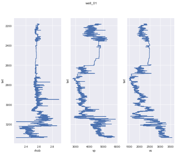
- 데이터 : 6개 유정의 로그 자료
- 총 데이터 : 12,019 개
- 훈련데이터(X_train) : 5개 유정의 로그 자료 - 9,243 개
- 시험데이터(X_test) : 1개 유정의 로그 자료 - 2,776 개
- labels : 3 개 (vp : P 파 속도 / vs : S 파 속도 / rho : 암석의 밀도)
2. 데이터 전처리
- 5 개 유정의 로그자료를 합치고(concatenate) 섞음(shuffle)
<code>
training_data = pd.concat(training_wells).sample(frac=1)
sample(frac=1) : 메소드가 shuffling
- 숫자가 커서 스케일링 : 0~1 사이 숫자로 변환
<code>
scaler = RobustScaler().fit(X_train)
3. 모델링
- 모듈 불러오기
<code>
import tensorflow as tf
from keras import models
from keras.models import Sequential, Model
from keras.layers import Dense, Input
import matplotlib.pyplot as plt
- 모델 구현
<code>
def nn_training(X, y, n_features, n_targets, nn_title, X_test):
model = Sequential(
[Input(shape=(n_features,)),
Dense(32, activation='sigmoid'),
Dense(128, activation='sigmoid'),
Dense(512, activation='sigmoid'),
Dense(64, activation='sigmoid'),
Dense(n_targets, activation='linear')]
)
optimizer = tf.keras.optimizers.RMSprop(0.001)
model.compile(optimizer=optimizer,
loss ='mse',
metrics=['accuracy'])
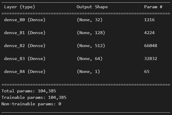
print(model.summary())
# 모델 훈련
history = model.fit(X, y,
validation_split=0.2,
epochs=500, verbose=1)
# 훈련과정 시각화 : 손실
plt.figure(figsize=(20, 16))
plt.subplot(2, 1, 1)
plt.plot(history.history['loss'])
plt.plot(history.history['val_loss'])
plt.title(nn_title + ' Model Loss')
plt.xlabel('Epoch')
plt.ylabel('Loss')
plt.legend(['Train', 'Test'], loc='upper left')
select_menu = {
'vp': [0, scaler_vp, y_test_scaled_vp],
'vs': [1, scaler_vs, y_test_scaled_vs],
'rho': [2, scaler_rho, y_test_scaled_rho]
}
x_label = 'TWT (ms)'
y_label = {
'vp': "Velocity (m/s)",
'vs': "Velocity (m/s)",
'rho': "Density (g/cm^3)"
}
sel = select_menu[nn_title][0]
sel_scaler = select_menu[nn_title][1]
sel_inv_scaled = select_menu[nn_title][2]
y_pred = model.predict(X_test)
y_test_inv = sel_scaler.inverse_transform(sel_inv_scaled)
y_pred_inv = sel_scaler.inverse_transform(y_pred)
plt.subplot(2, 1, 2)
plt.plot(y_test_inv, label=nn_title+' True')
plt.plot(y_pred_inv, '--', color='orange', label=nn_title+' Prediction')
plt.xlabel(x_label)
plt.ylabel(y_label[nn_title])
plt.legend()
img_name = nn_title + '_result.png'
plt.savefig(img_name, dpi=200, edge_color='darkgray')
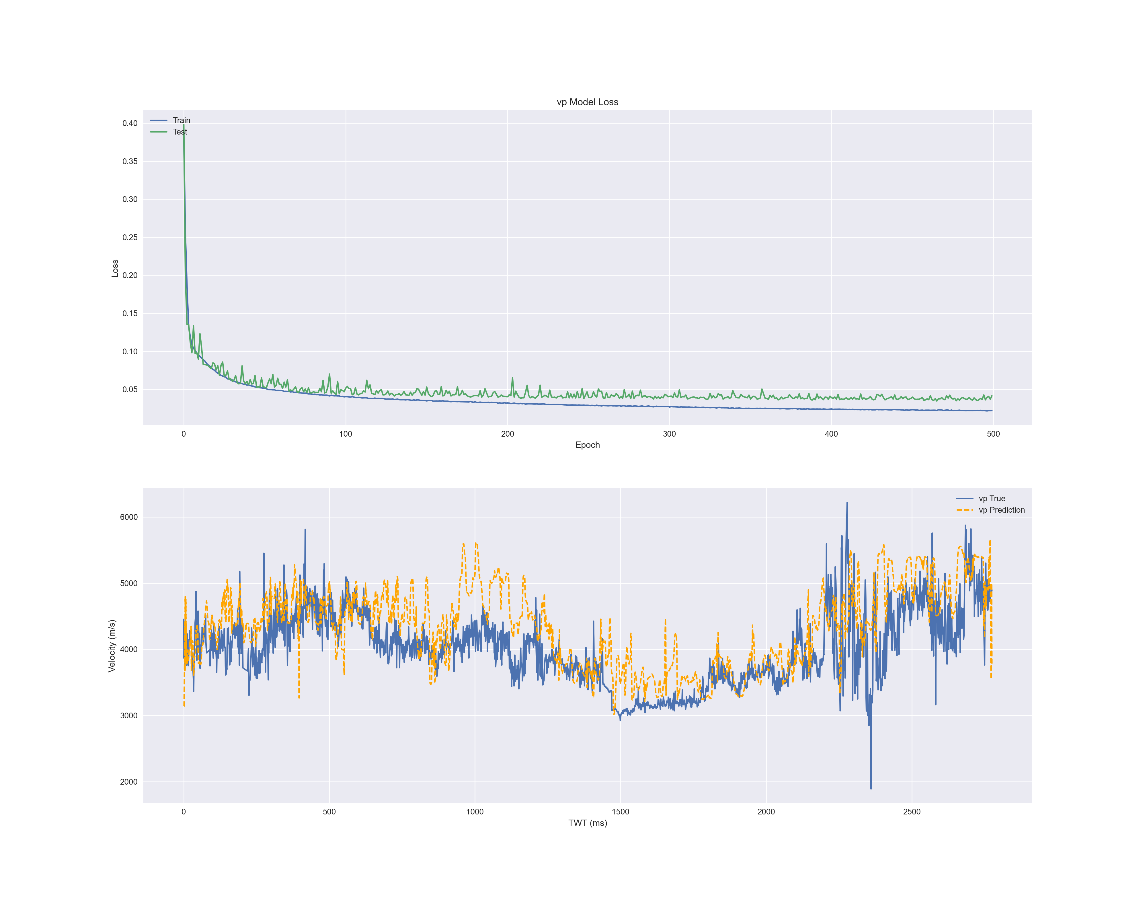
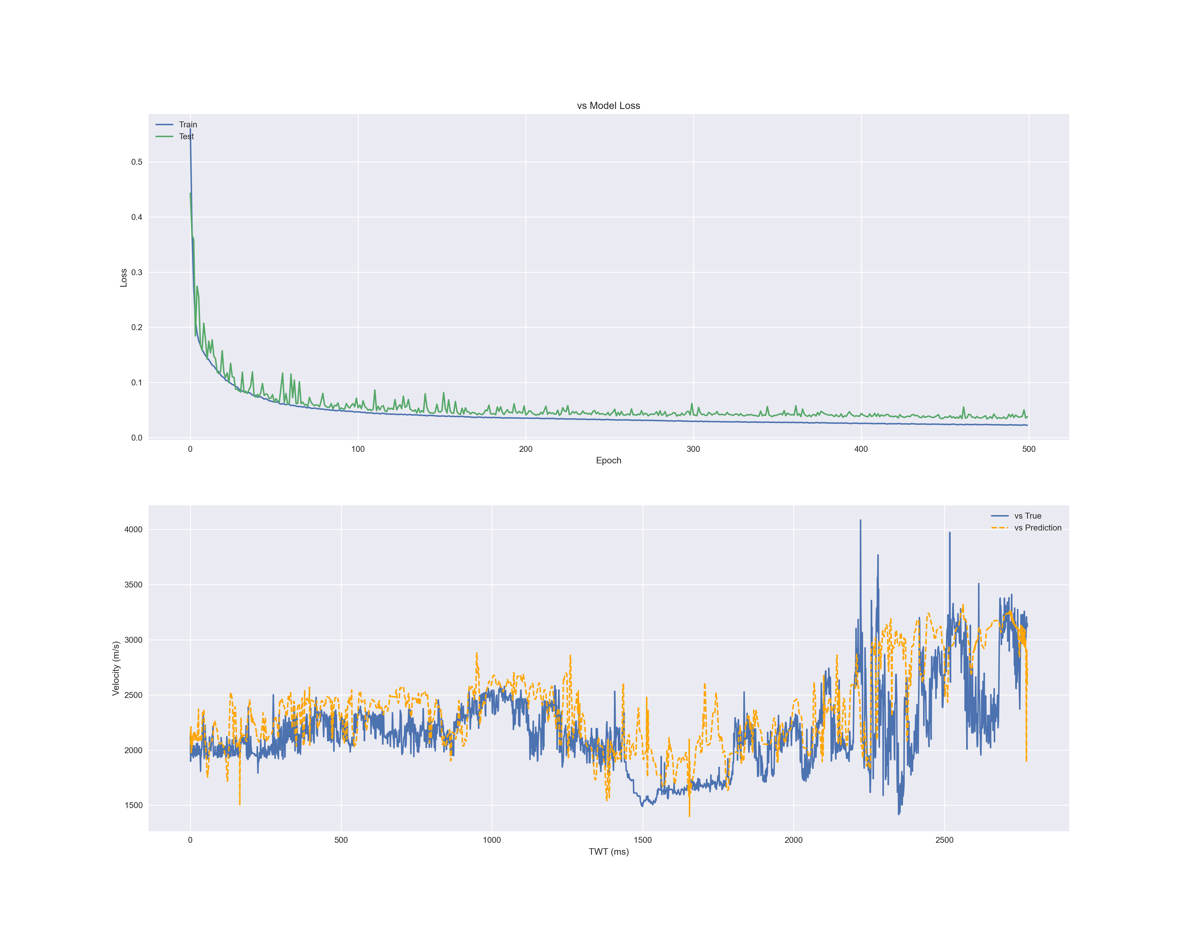
vp, vs, rho 각각 레이블로 정하고 훈련이 되도록 함수로 만들었습니다.
epoch=500 은 배치파일로 500번을 훈련시킨 것입니다.
복잡한 LSTM이나 CNN이 아니라 신경망으로 5개 층을 쌓아서 훈련하였습니다.
스케일한 것을 inverse를 통해 원래 값으로 변환시키는 과정입니다.
<code>
y_pred_inv = sel_scaler.inverse_transform(y_pred)
모델 summary입니다.
- 함수 호출
<code>
# vp(velocity of p waves) training
nn_title = 'vp'
y_vp = y[:, 0]
nn_training(X, y_vp, n_features, 1, nn_title, X_test)
# vs(velocity of s waves) training
nn_title = 'vs'
y_vp = y[:, 1]
nn_training(X, y_vp, n_features, 1, nn_title, X_test)
# rho(density of rock_material) training
nn_title = 'rho'
y_vp = y[:, 2]
nn_training(X, y_vp, n_features, 1, nn_title, X_test)
이렇게 함수를 호출하여 결과를 얻었습니다.
회귀문제이기 때문에 정확도는 큰 의미가 없고 결과입니다.
4. 결과
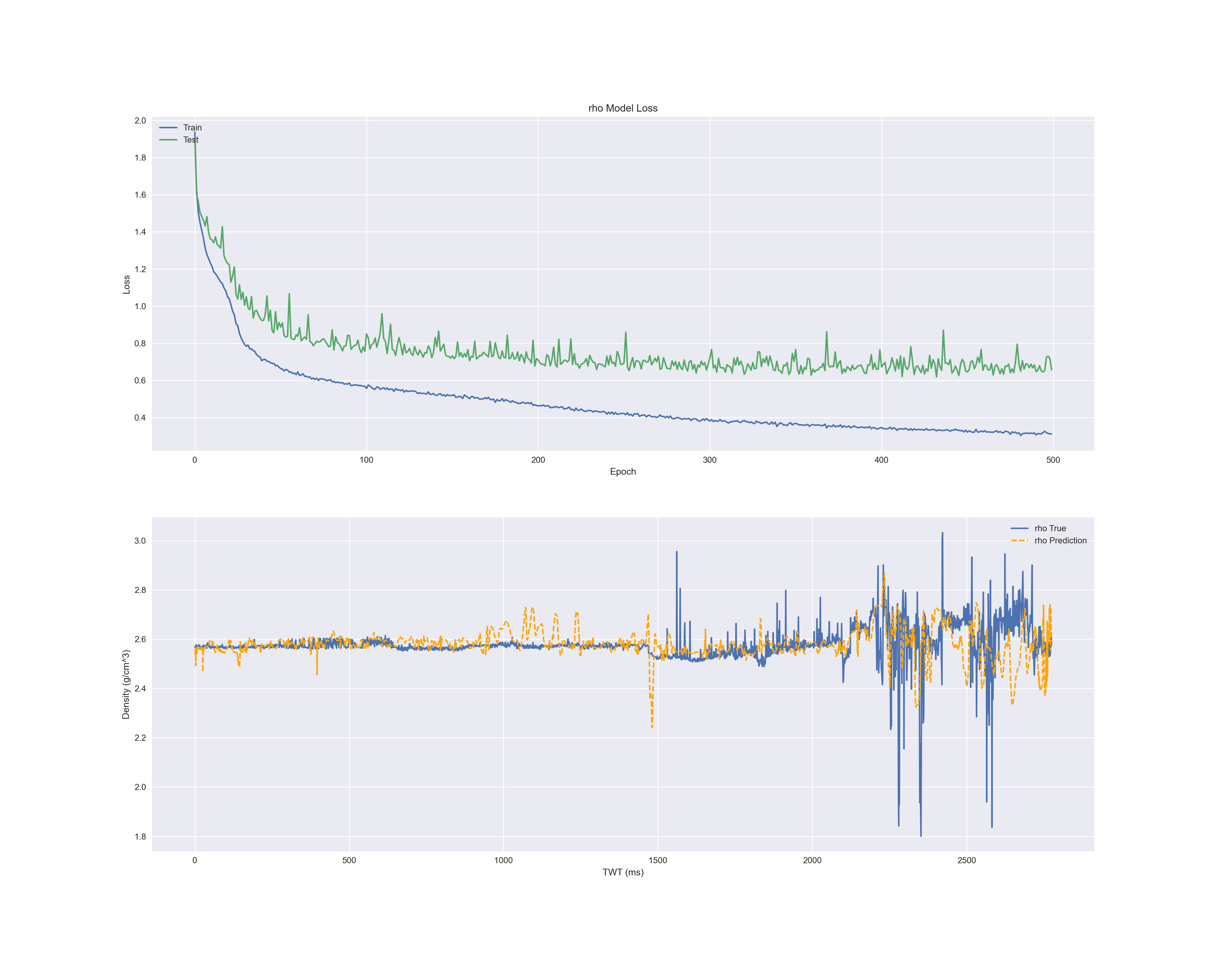
각 결과의 첫 번째 그래프는 에폭마다 손실입니다.
파란색은 X_train, 초록색은 Validation Data입니다.
두 번째 그림은 실제 데이터(X_test의 레이블인 y_test)와 예측한 데이터(y_predict)와 비교 그래프입니다.
파란색은 실제 값, 주황색은 예측 값으로 그린 것입니다.
- P 파 속도
- S 파 속도
- 밀도
'machineLearning > tensorflow' 카테고리의 다른 글
| 210721 tf_imageSegmentation (1) | 2021.07.21 |
|---|---|
| 210720 tf_imageAugmentation (1) | 2021.07.21 |
| tf_imageTransferLearning (0) | 2021.07.15 |
| tf_CNN (0) | 2021.07.13 |
| tf_distributeCustomTraining (0) | 2021.07.11 |
공지사항
최근에 올라온 글
최근에 달린 댓글
- Total
- Today
- Yesterday
링크
TAG
- image depict
- 파이썬
- ChatGPT
- TensorFlow
- Python
- multi modal
- 챗봇
- 프로그래머스
- prompt
- FewShot
- Chatbot
- 약수
- streamlit
- programmers
- programmers.co.kr
- 변화율
- GPT
- RAG
- 미분
- 미분계수
- AI_고교수학
- LLM
- 도함수
- 텐서플로우
- LangChain
- 로피탈정리
- 고등학교 수학
- checkpoint
- 미분법
- 랭체인
| 일 | 월 | 화 | 수 | 목 | 금 | 토 |
|---|---|---|---|---|---|---|
| 1 | 2 | 3 | ||||
| 4 | 5 | 6 | 7 | 8 | 9 | 10 |
| 11 | 12 | 13 | 14 | 15 | 16 | 17 |
| 18 | 19 | 20 | 21 | 22 | 23 | 24 |
| 25 | 26 | 27 | 28 | 29 | 30 | 31 |
글 보관함